Mobile Menu

Menu
- Rruga B, Prishtinë
- +38349133000
- info@hoxmedia.net
Loading
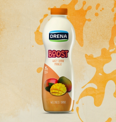
Healthy & tasty products are Drena’s specialty, whereas fun & striking packaging is ours. Here’s a clear example.
All work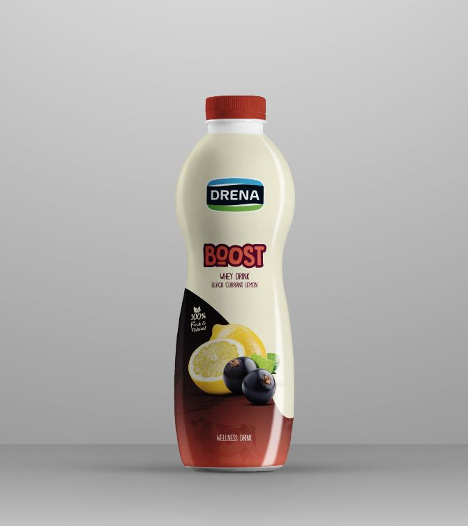
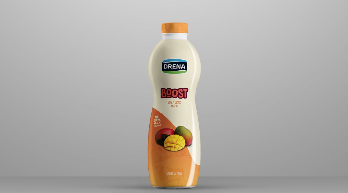
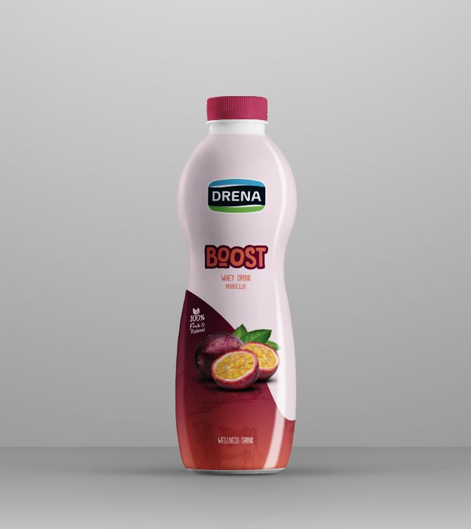
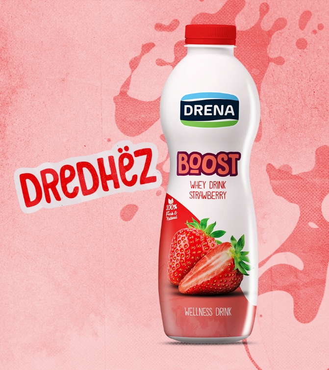
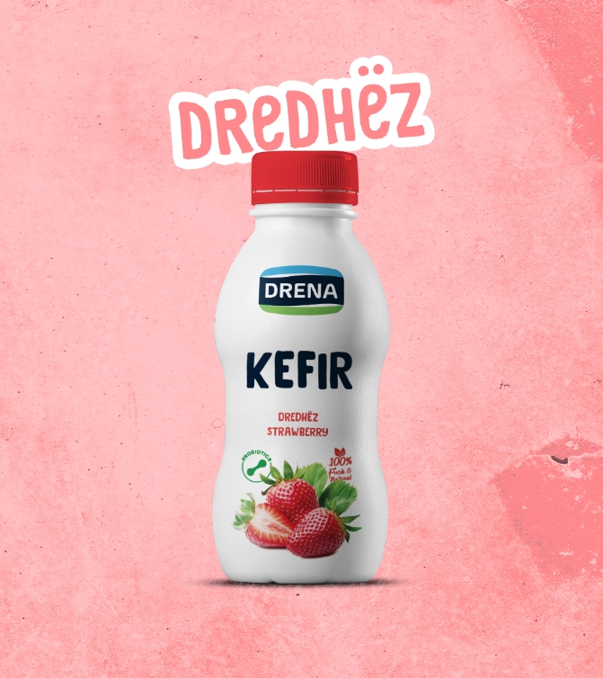
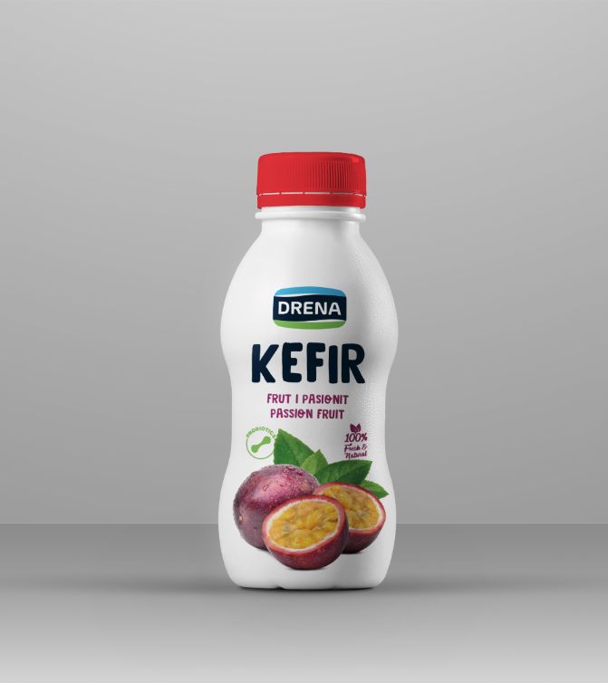
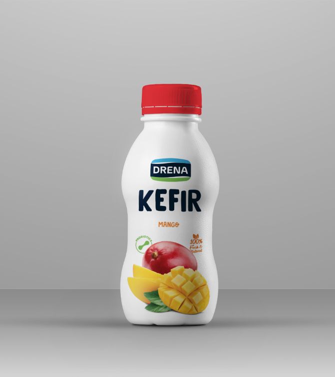
Kefir has a presentation problem on a chilled shelf. It is a healthy product in a category that mostly signals health by looking clinical — white, blue, medical — and Drena wanted theirs to look like something you would actually enjoy drinking.
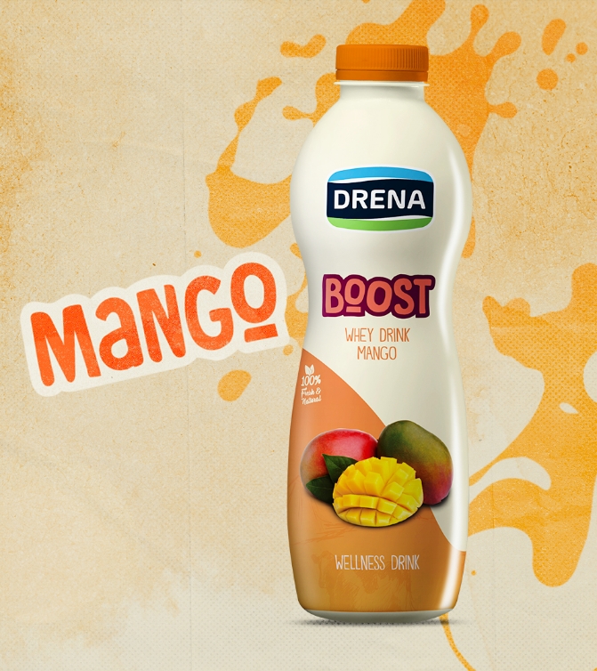
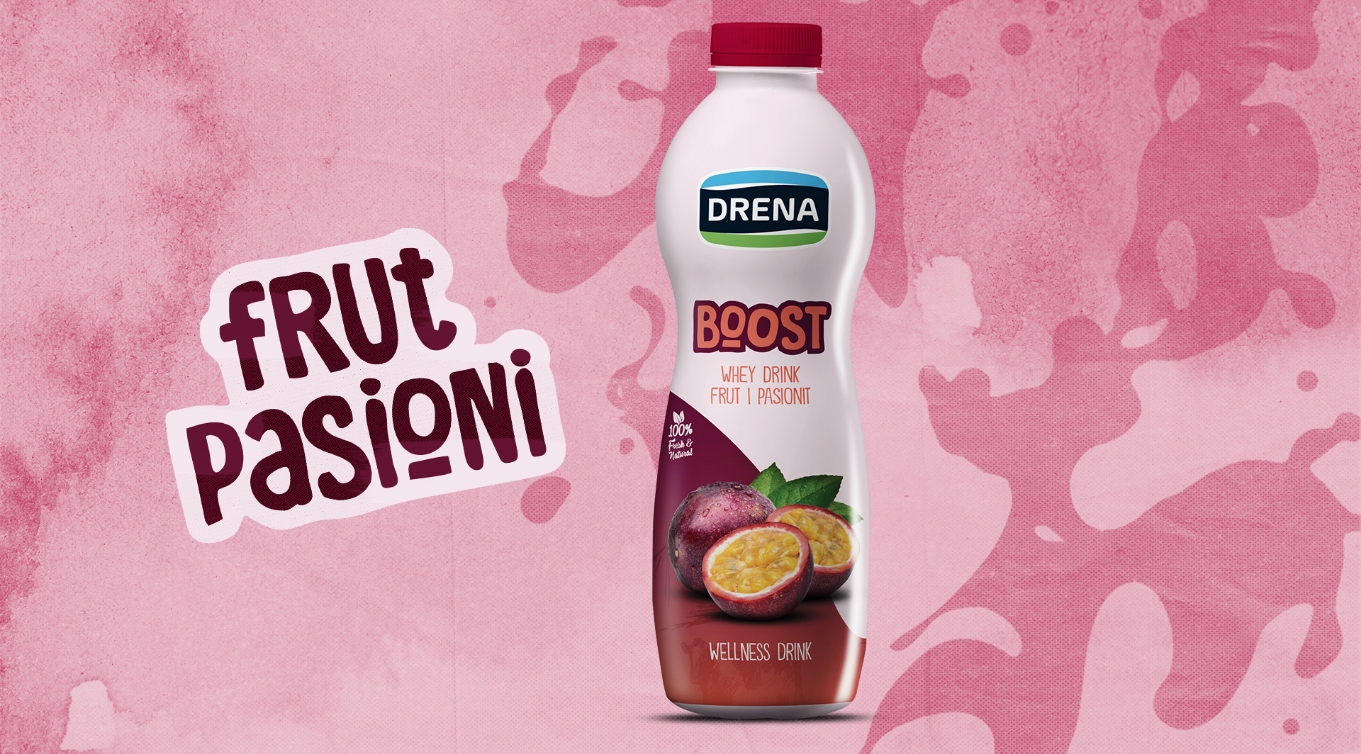
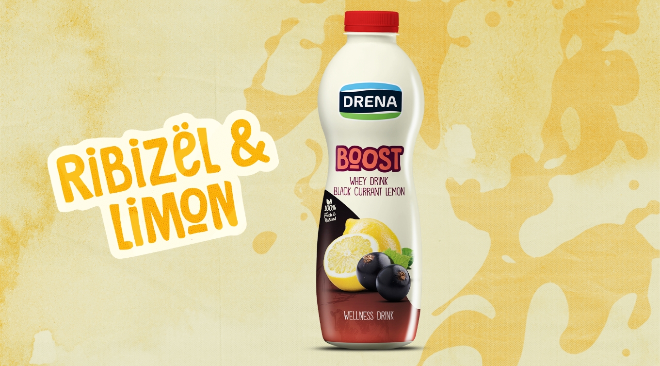
Colour did the work. The pack was designed to be found from a metre away by its block of colour alone, with the product name large enough to read through a fridge door, and the health claims where they belong: present, legible, and not the loudest thing on the label. The structure was drawn around a bottle that has to survive condensation and handling.
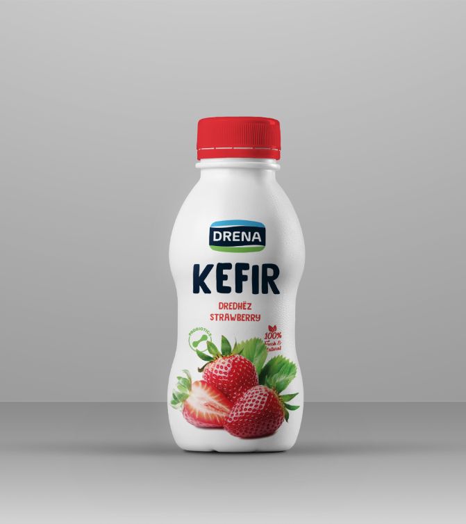
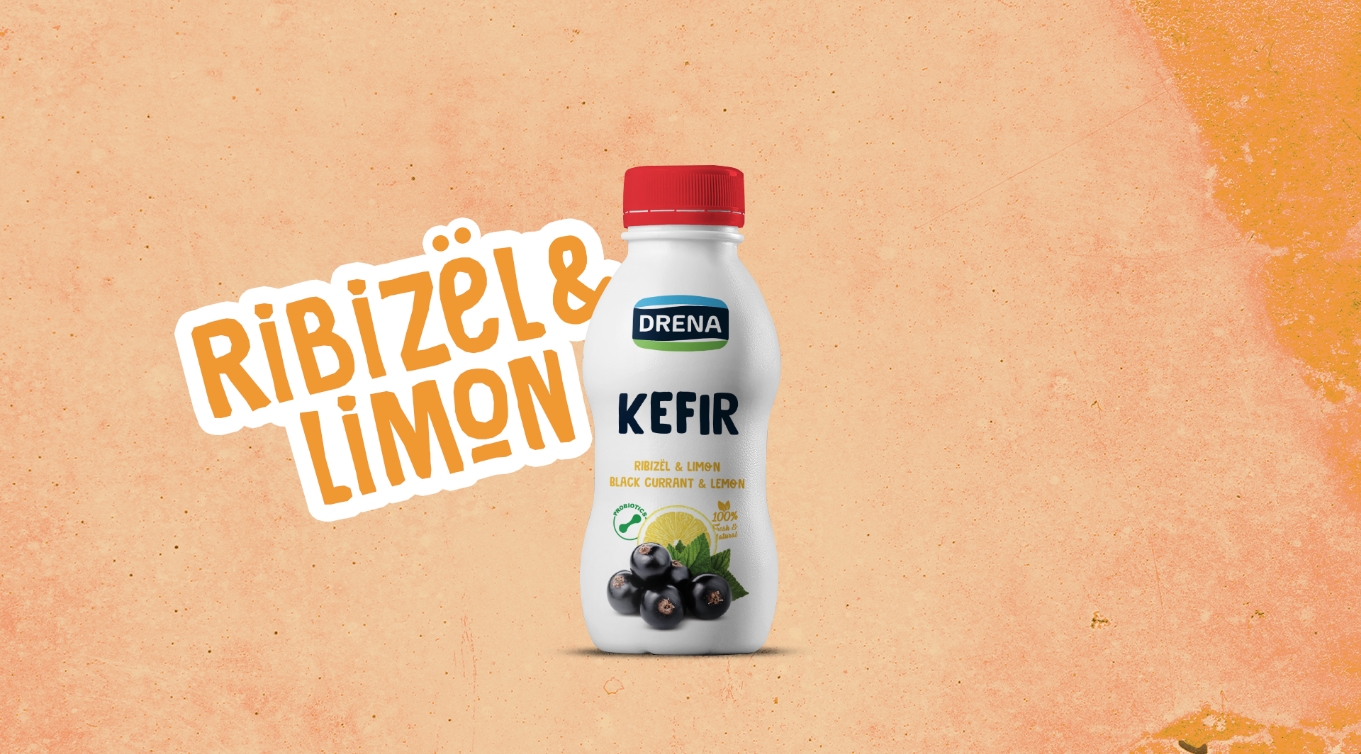
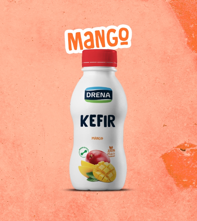
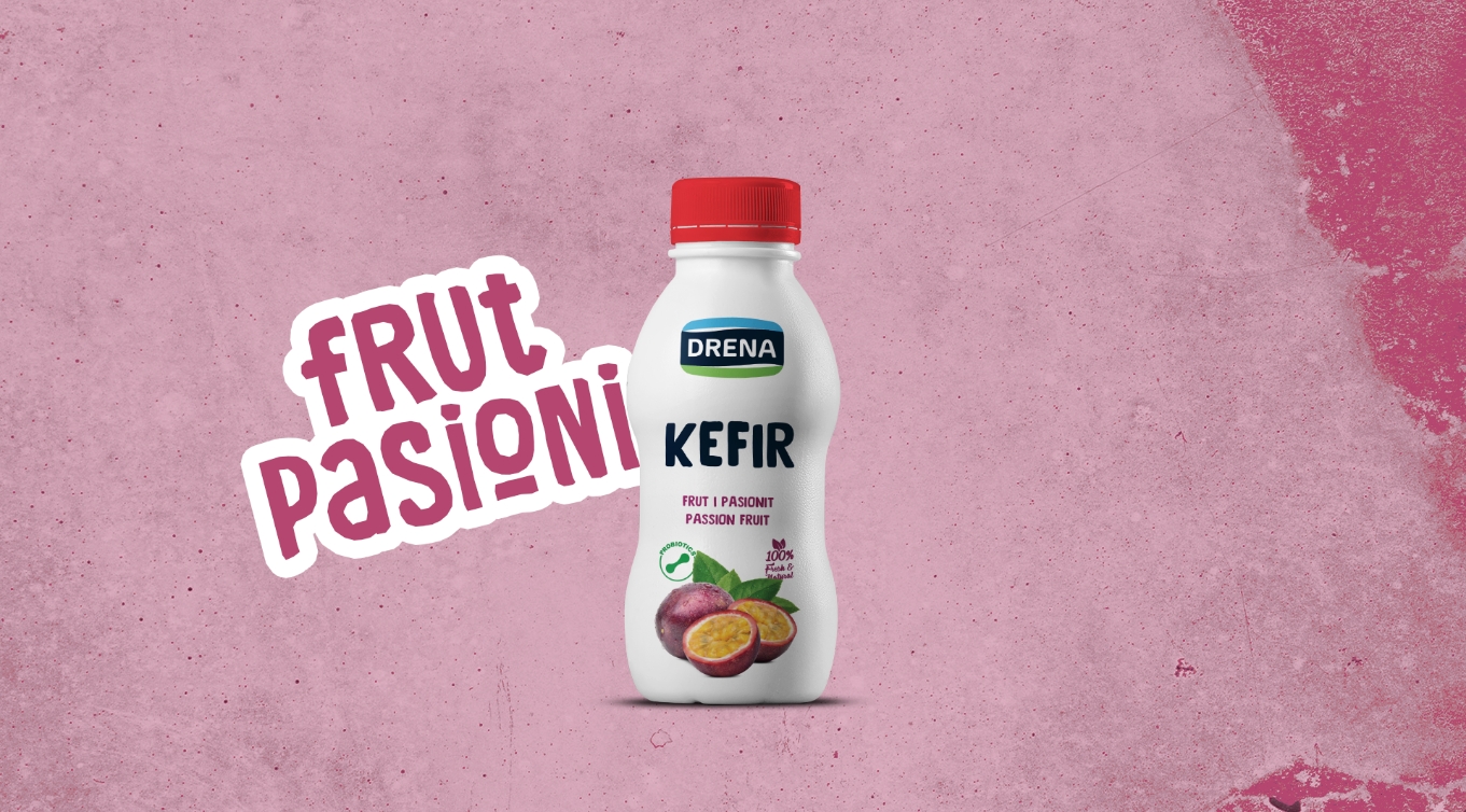
The pack stands out in a run of white competitors and still reads as food rather than as medicine. Every printing surface was supplied as production artwork, made to the printer's specification rather than to a screen's.