Mobile Menu

Menu
- Rruga B, Prishtinë
- +38349133000
- info@hoxmedia.net
A distinctive brand identity that leaves a lasting impression.
Distinct. Consistent. Memorable.
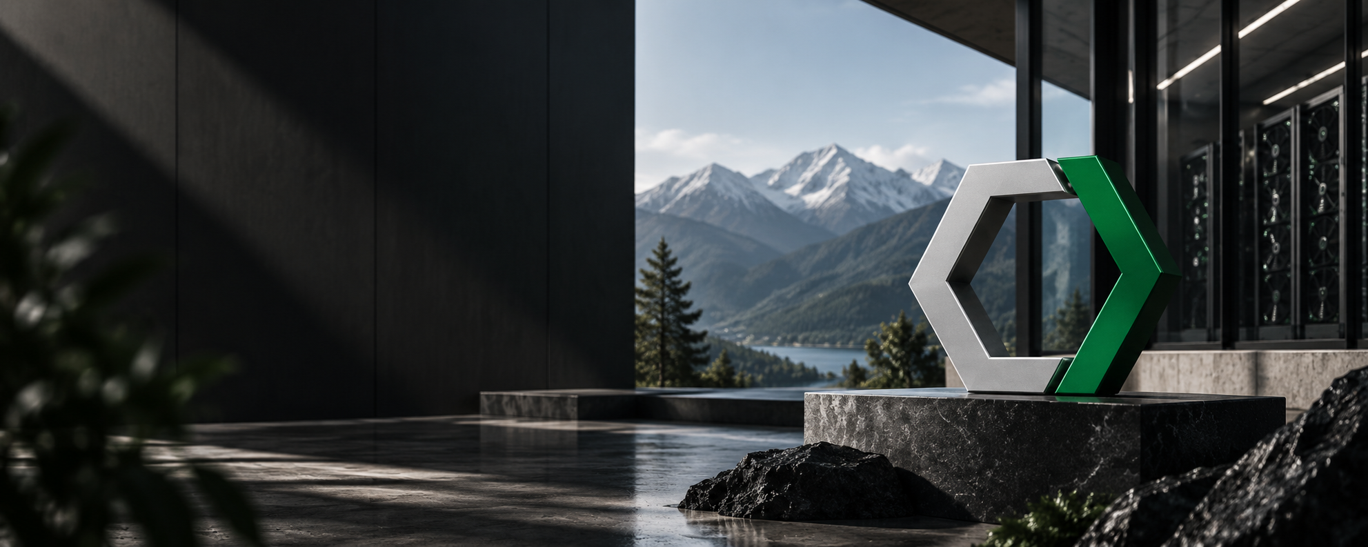
Cryptokos mines cryptocurrency: rooms of machines that never stop, converting power into computation. The company wanted an identity built on innovation, movement and force, not on the visual clichés the sector had already worn out: the coins and the padlocks and the endless upward arrows.
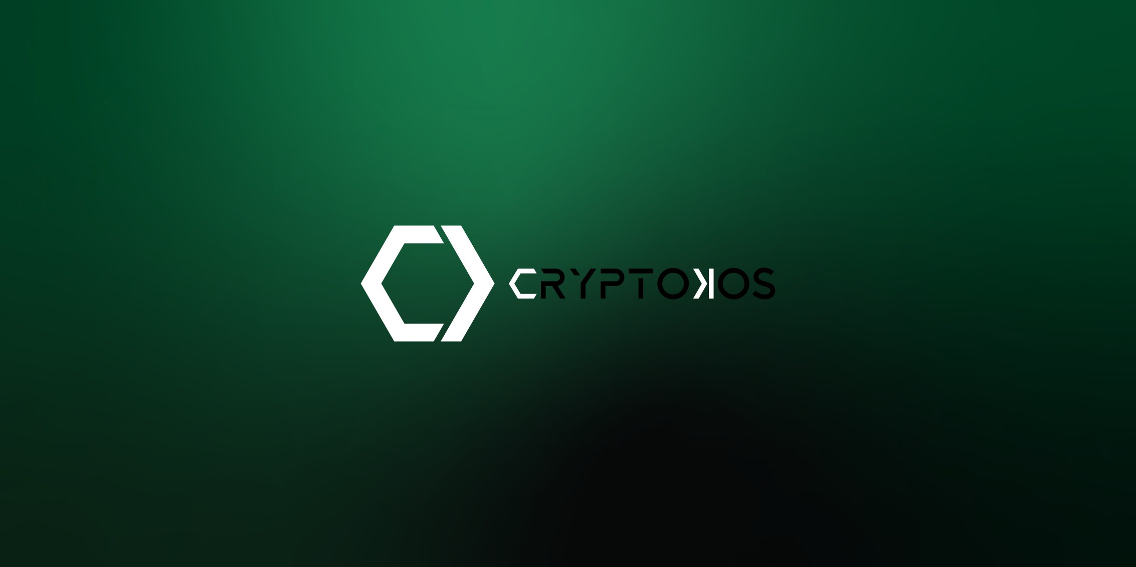
The mark was drawn as a solid worked from the inside, so it reads as a form with depth rather than as a flat symbol: a shape that appears to be turning even while it is still. It was resolved in black and white first, at the size of a favicon, because most of the places this business is seen are small and lit by a screen.

What went out is a mark that survives being cut into metal on a machine housing and rendered at sixteen pixels in a browser tab, with the palette, the typography and the rules for all three. The same system then carried the website and the social channels, so the company reads as one thing wherever it is met.