Mobile Menu

Menu
- Rruga B, Prishtinë
- +38349133000
- info@hoxmedia.net
A distinctive brand identity that leaves a lasting impression.
Distinct. Consistent. Memorable.
Marlette is a restaurant and café, and what it sells beyond the food is the feeling of the room: warmth, company, an hour with people you like. That is far harder to draw than a plate is.
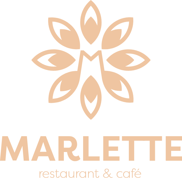
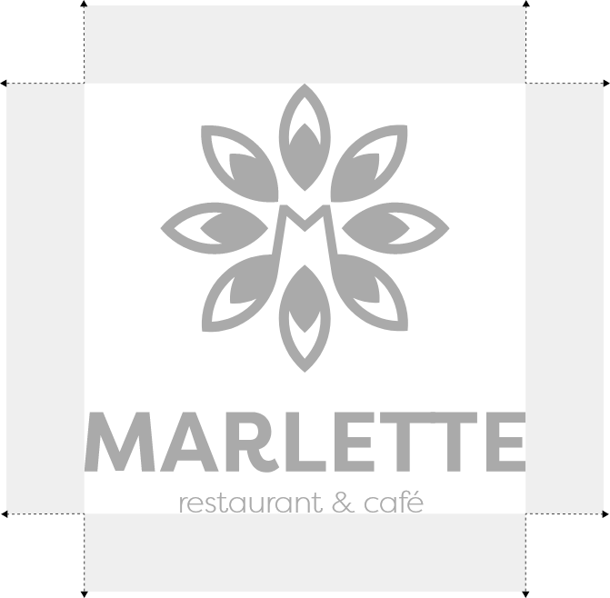
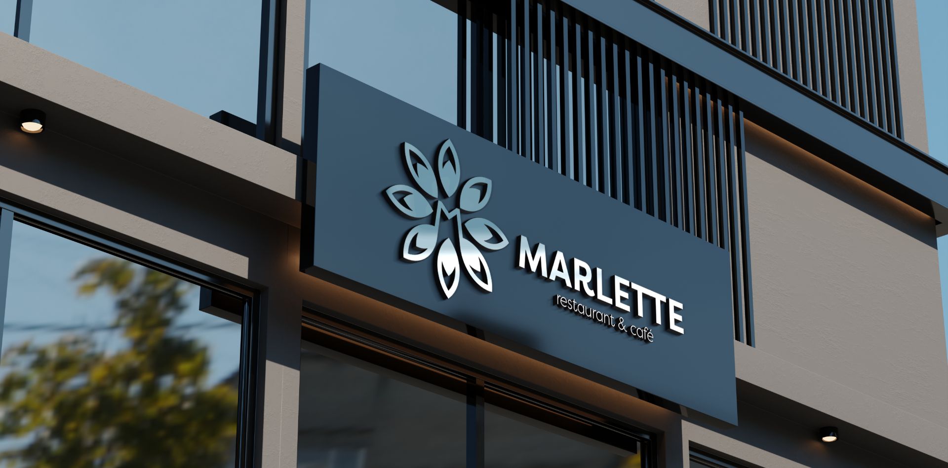
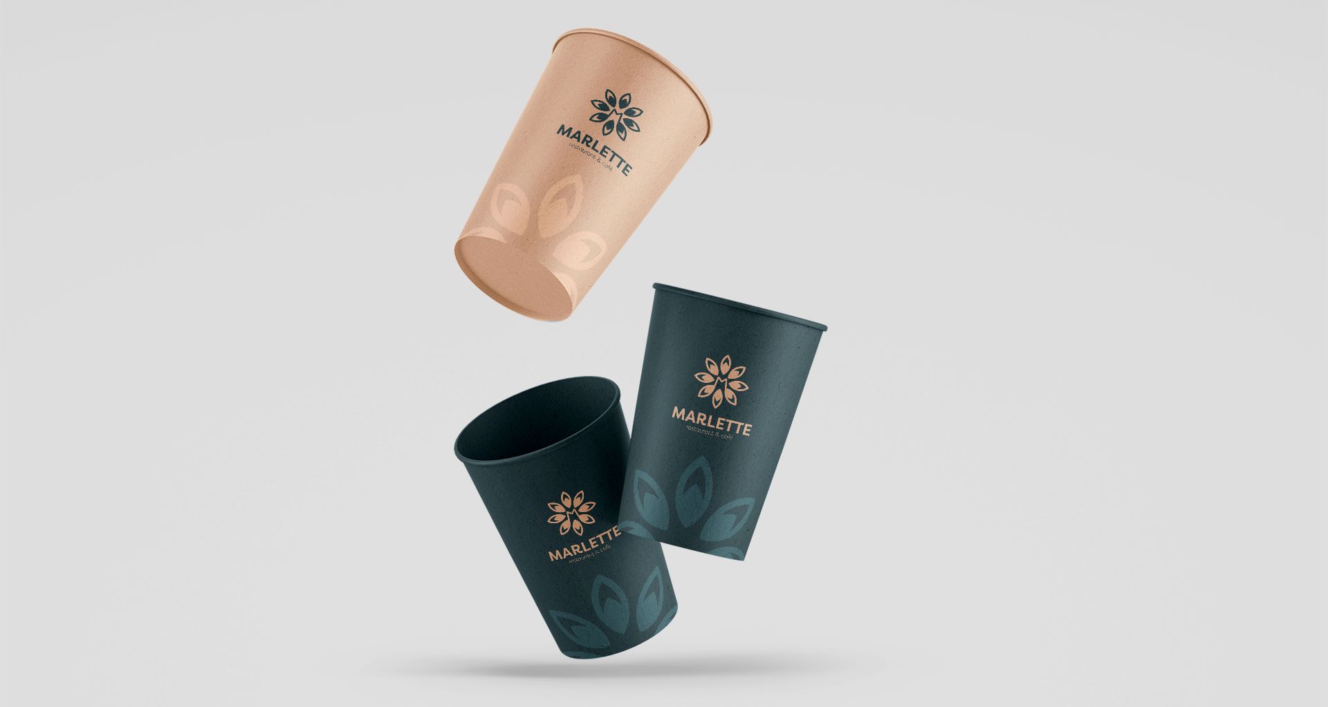
We built the mark around a form that grows outwards from a centre, which is the shape of a table with people around it and of a flower opening, and let the symmetry do the work of saying harmony. It was drawn to sit as comfortably foil-blocked on a menu as embroidered on an apron or cut into a sign.
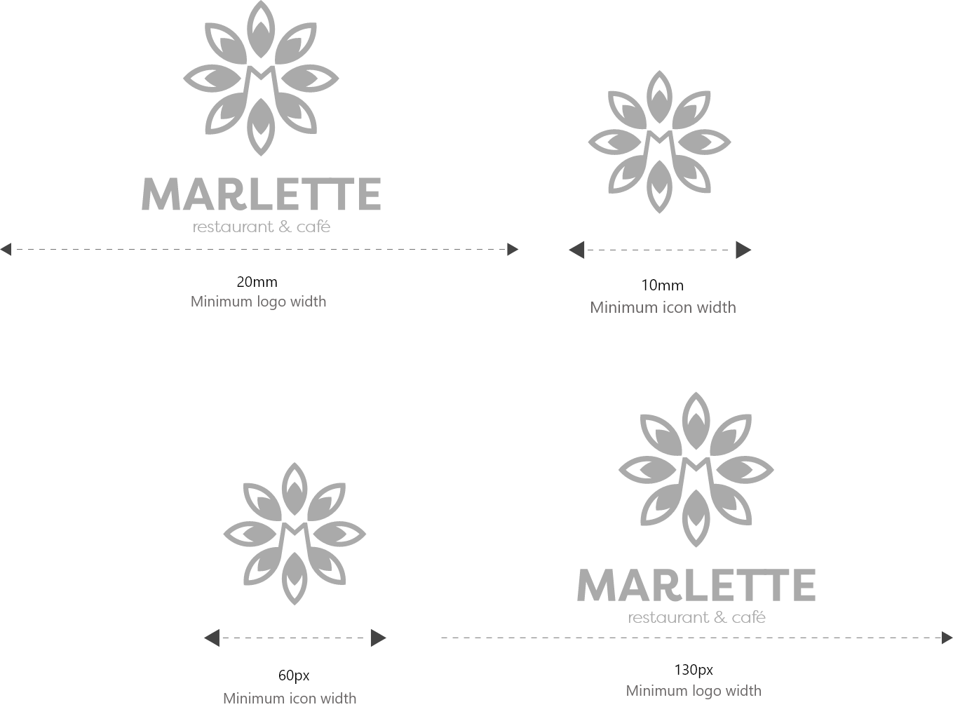
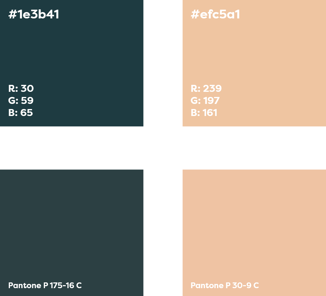
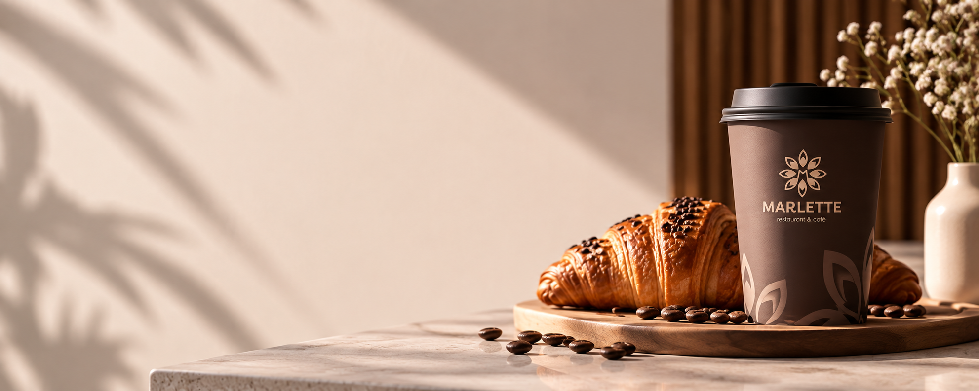
The identity gives the room something to sign itself with, in a set of formats that covers the surfaces a restaurant prints. The same system was then carried into the social channels.