Mobile Menu

Menu
- Rruga B, Prishtinë
- +38349133000
- info@hoxmedia.net
A distinctive brand identity that leaves a lasting impression.
Distinct. Consistent. Memorable.
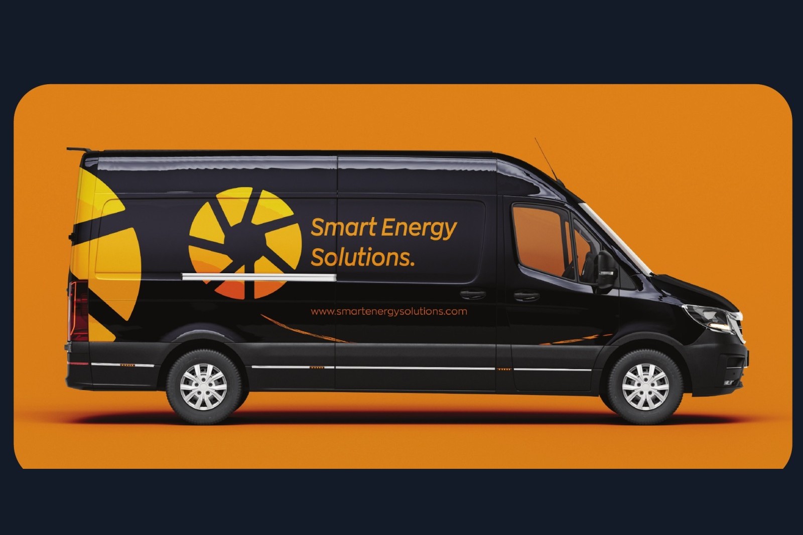
SES does careful, certified work with solar and storage, and none of it showed. The company had no mark of its own, quotes and paperwork went out in whatever typeface was open that day, and on a street where every installer paints a van, there was nothing to tell theirs from the next one.
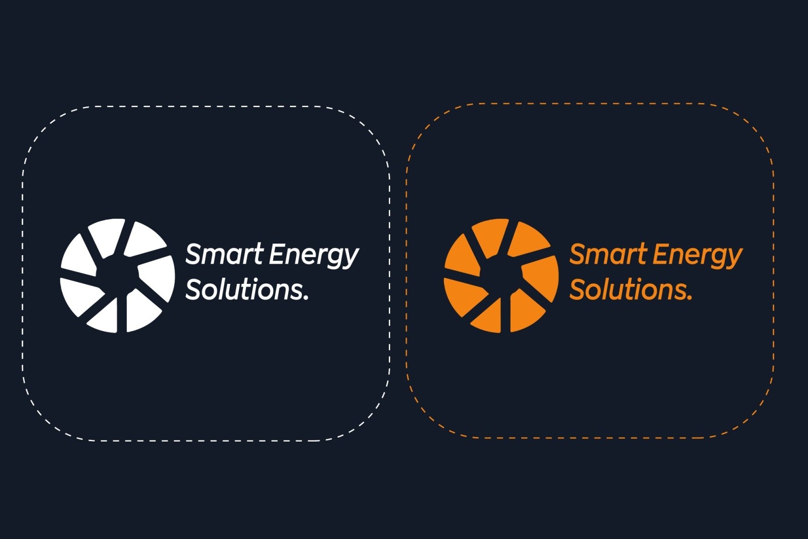
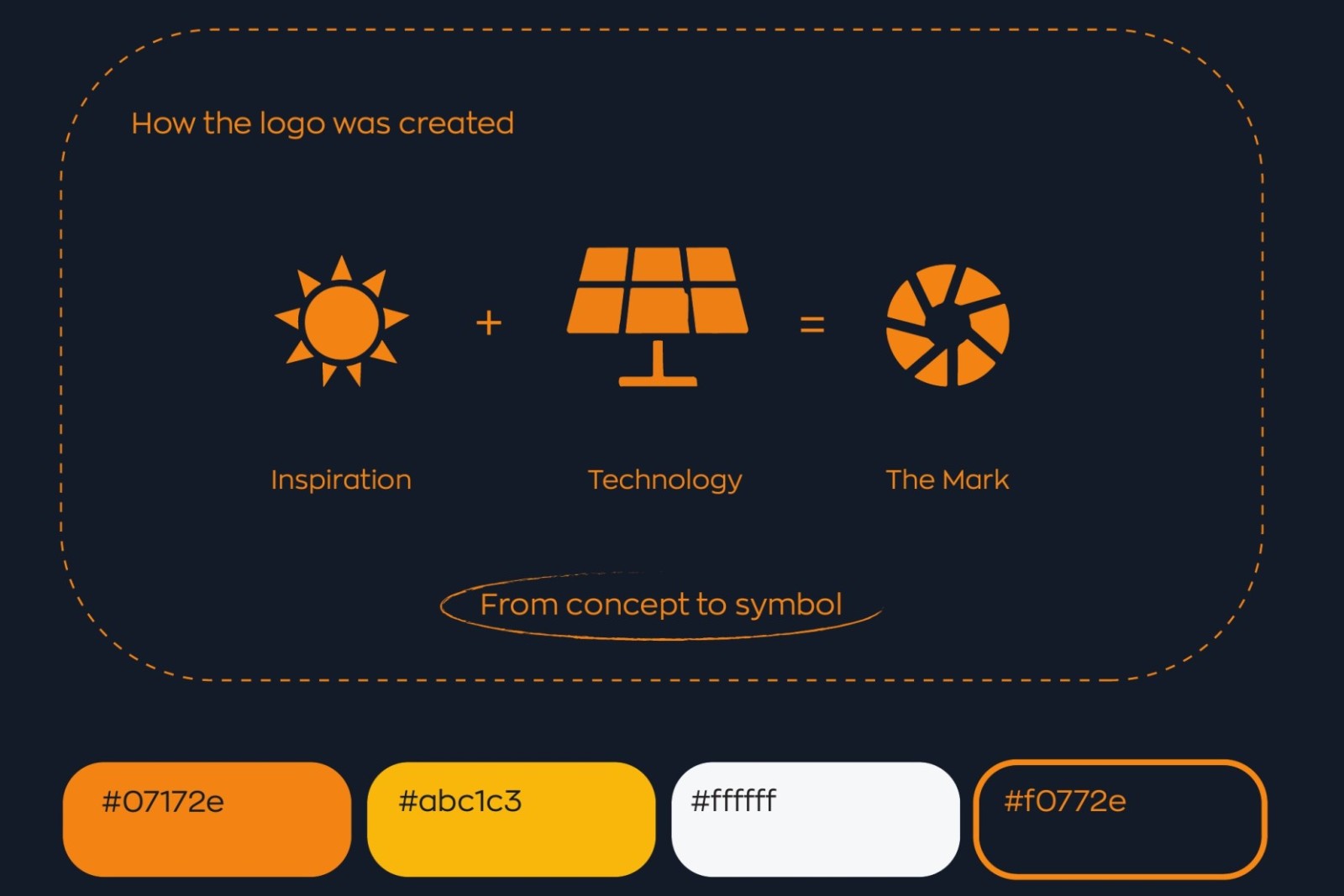
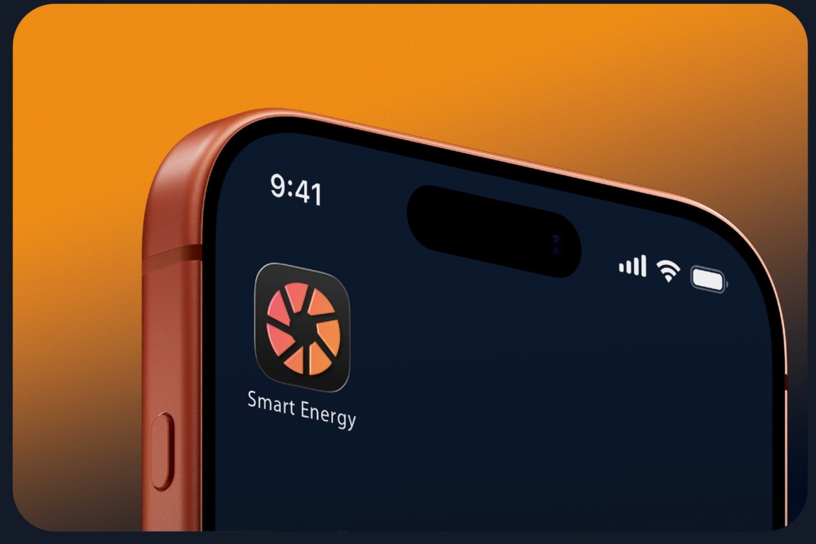
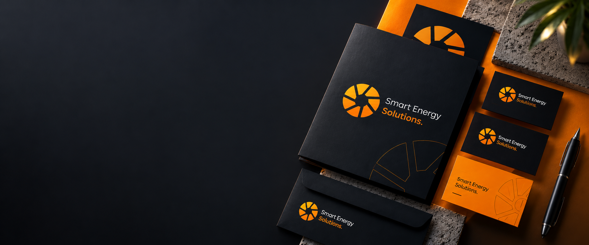
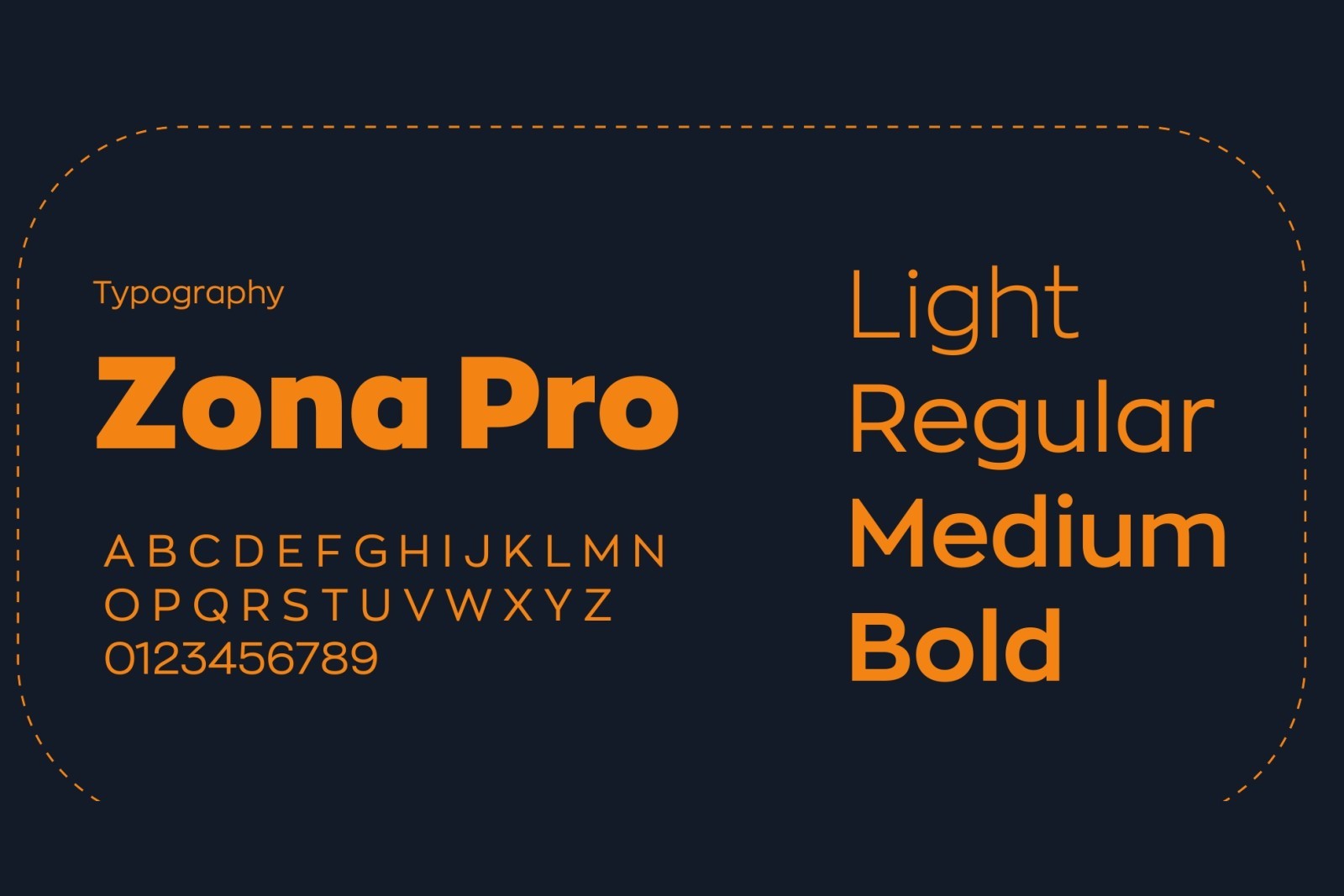
We drew the mark out of what the company actually does, the sun and a solar panel turned into one aperture that still reads as an app icon or across the side of a van. Deep navy carries the engineering, orange carries the energy, Zona Pro carries the words, and every piece was tested small before it was tested big.
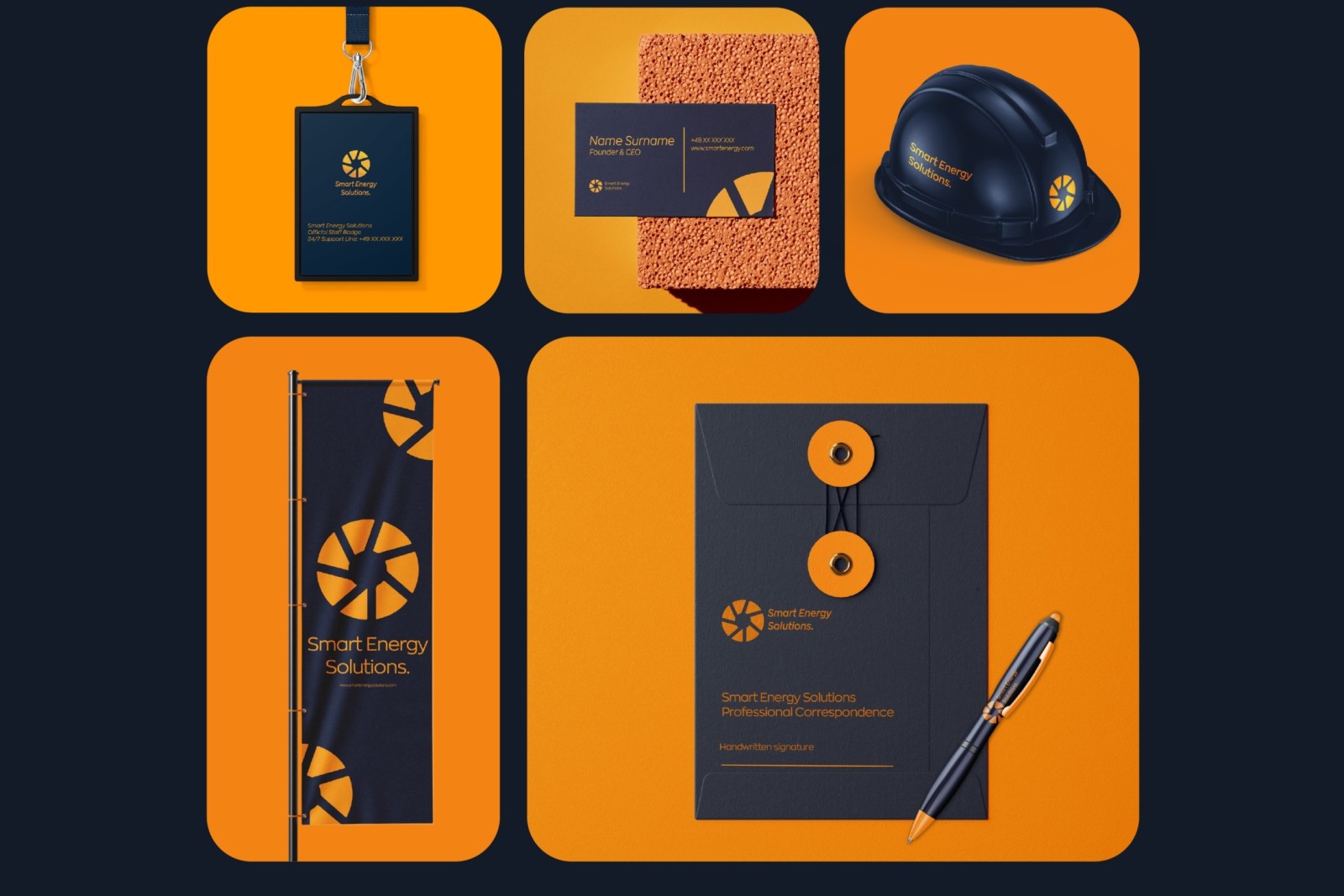
SES now meets its customers the same way everywhere: the lit sign above the door, the van parked outside the house, the badge on the installer, the envelope the contract arrives in. The company finally looks the size it is, and as careful on the street as it is on the roof.