Mobile Menu

Menu
- Rruga B, Prishtinë
- +38349133000
- info@hoxmedia.net
A distinctive brand identity that leaves a lasting impression.
Distinct. Consistent. Memorable.
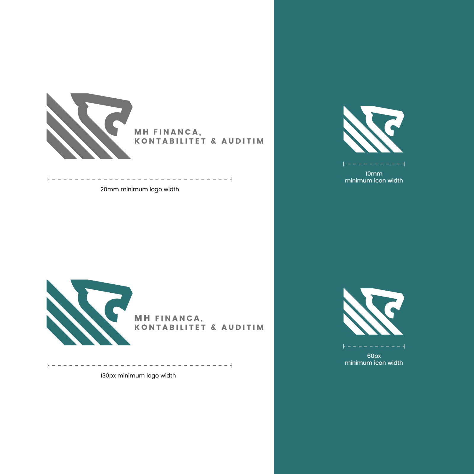
MH Financa keeps the books for businesses: the accounts, the financial statements and the audits that have to stand up to scrutiny. The firm wanted an identity that carried authority and trust at once, not the stock language of the sector: the calculators, the rising bar charts and the anonymous blue.


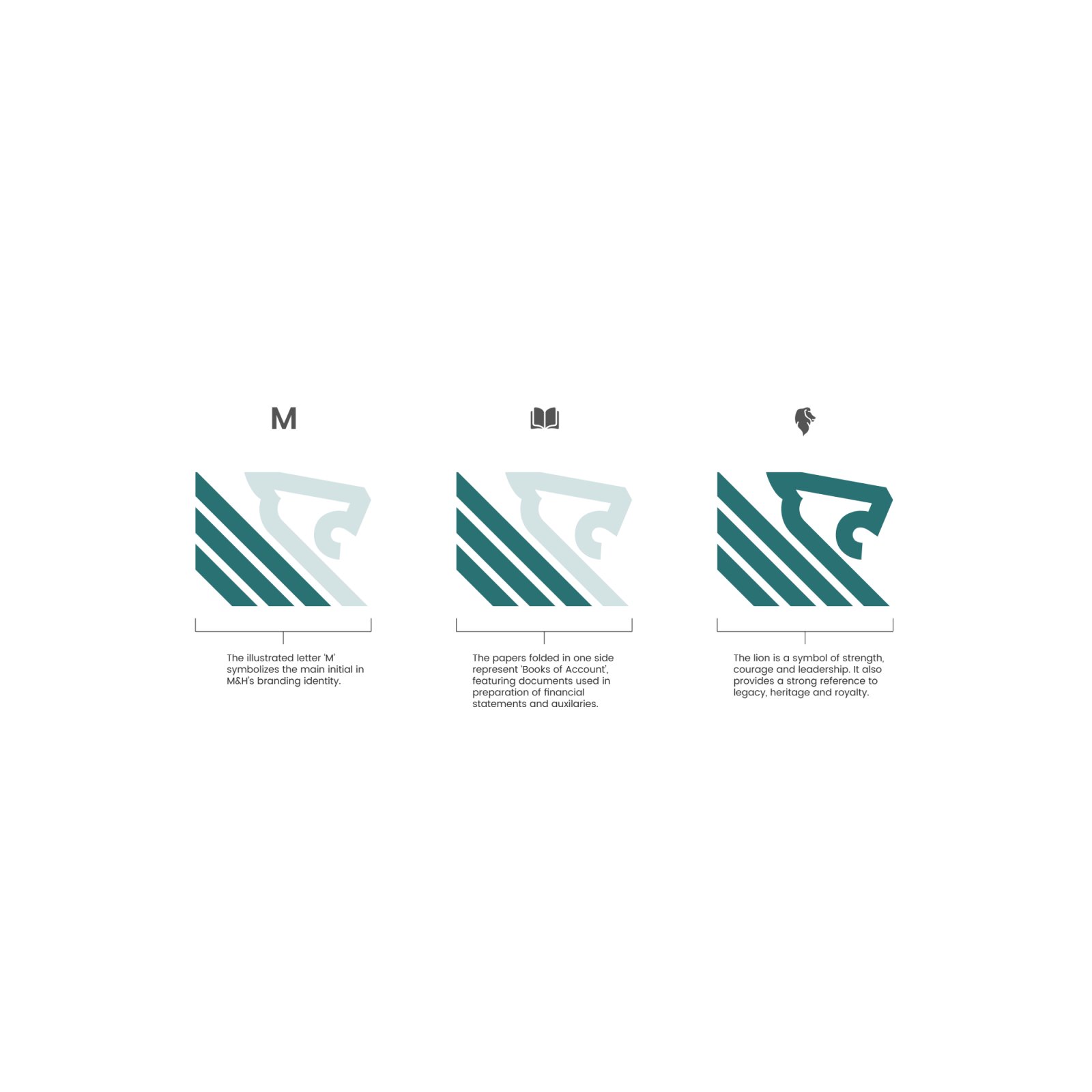
The mark joins three ideas in one drawing. The diagonal strokes are an M, the firm’s initial, and they fold like the pages of a book of account, the ledger every financial statement starts from. Out of the top of them rises a lion’s head, for strength, leadership and a practice meant to last.
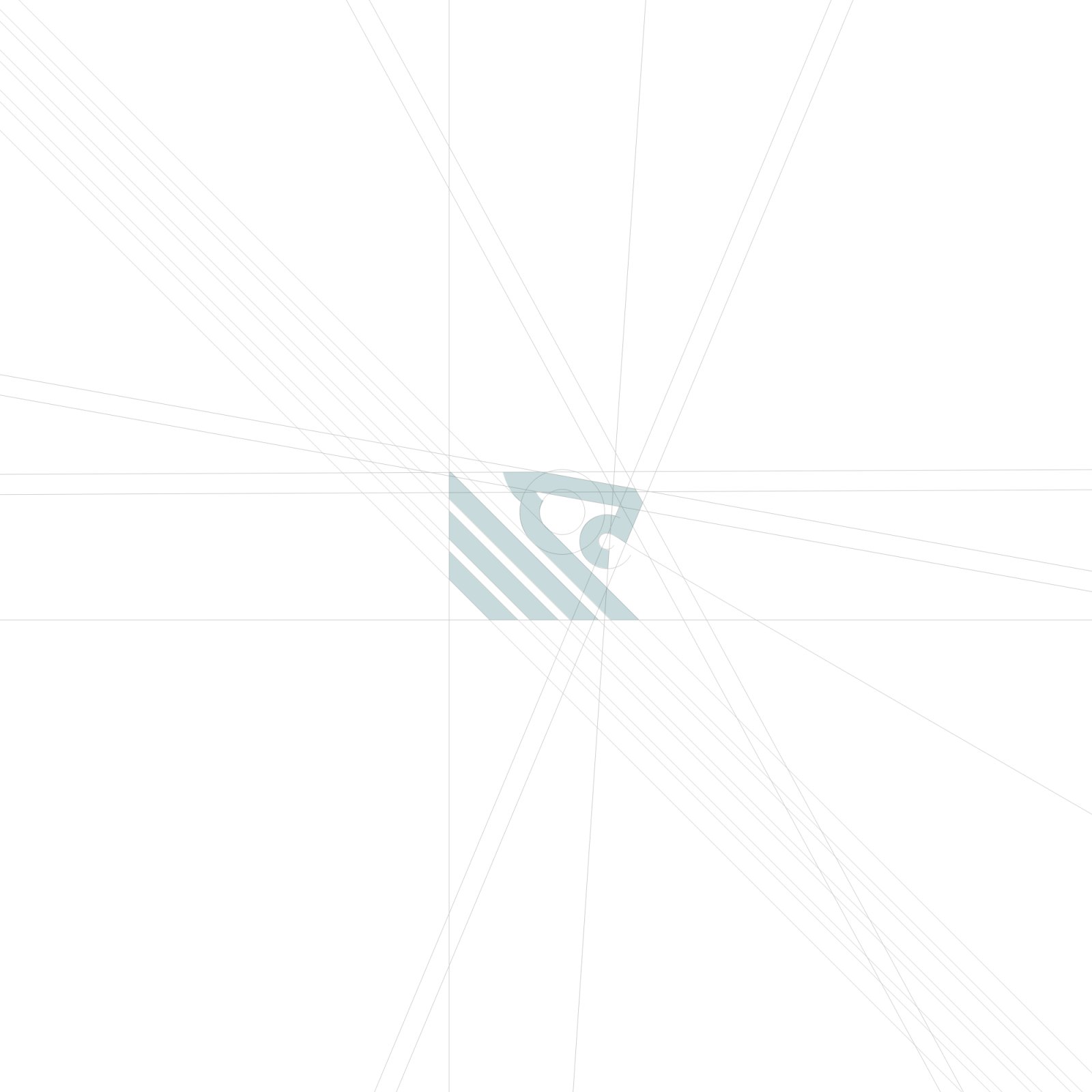
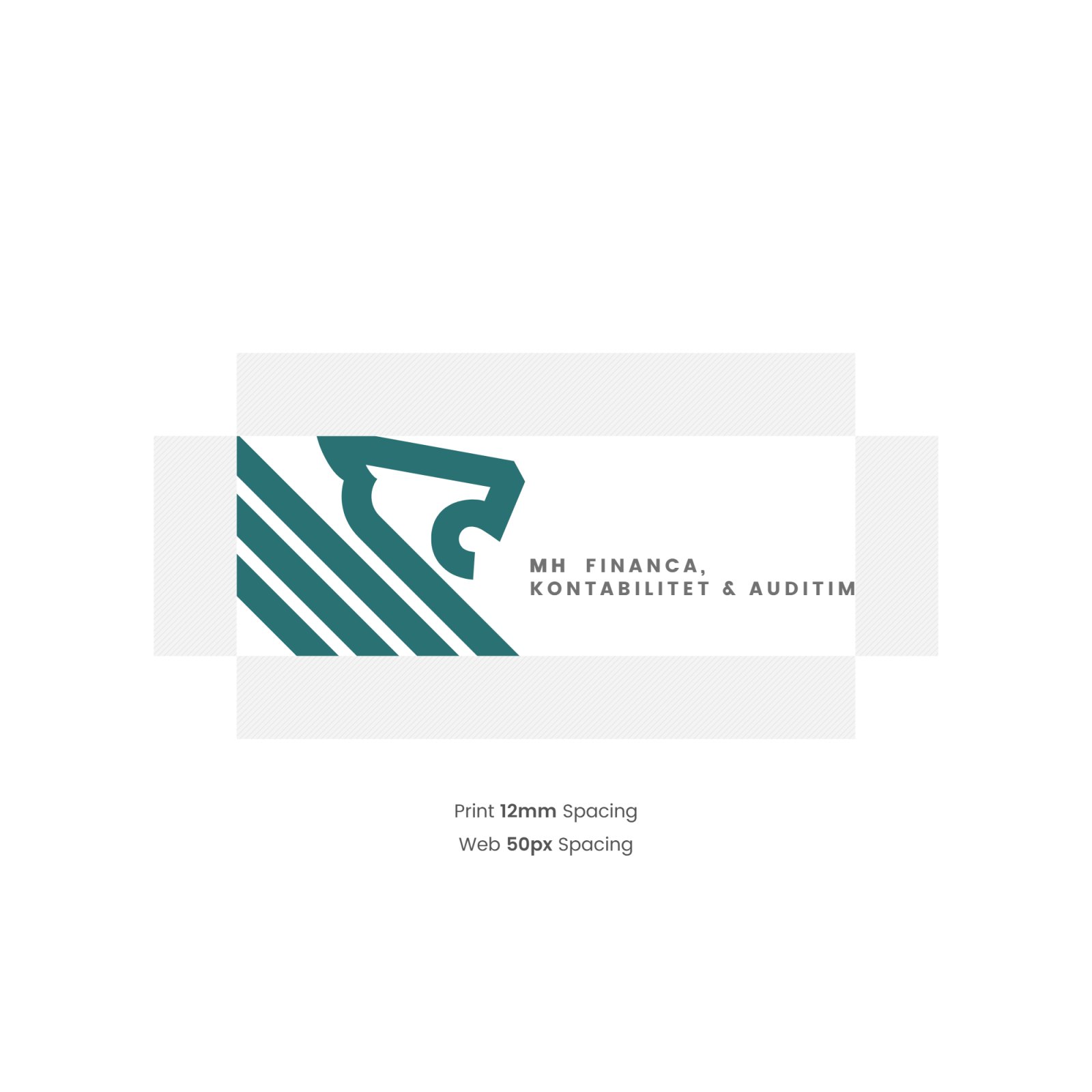
What went out is a mark that holds together embossed on paper, on a window and on a business card, in North Sea Green and Poppins. The construction grid, the clear space and the minimum sizes came with it, so it stays the same on every report, letter and card the firm puts its name to.