Mobile Menu

Menu
- Rruga B, Prishtinë
- +38349133000
- info@hoxmedia.net
Packaging that sells the product before it is opened.
Bold. Clear. Shelf ready.
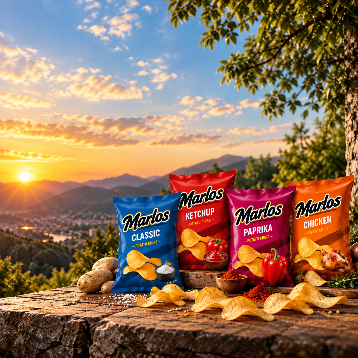
Drena had a product it was confident in and packaging that was not carrying it. On a shelf where every neighbour claims the same virtues, the pack has about a second to say which of them is true here.
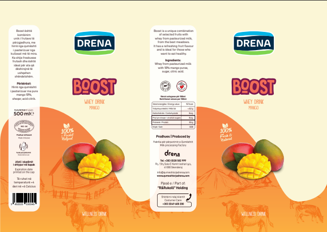
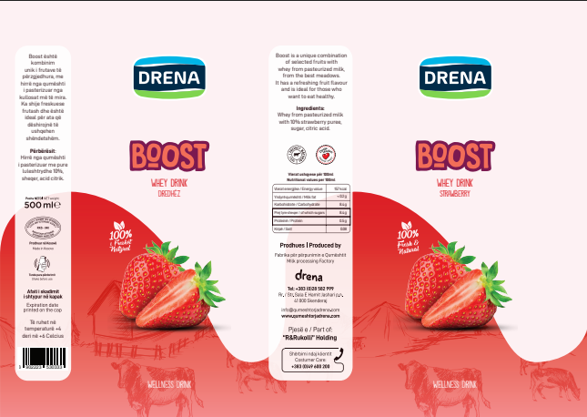
We worked out what one thing the pack had to communicate before it communicated anything else, and made everything else give way to it. Type sized for reading at arm's length under supermarket lighting; a colour that separates the product from its neighbours rather than from a mood board; a hierarchy that survives the pack being stacked, turned and half-hidden.
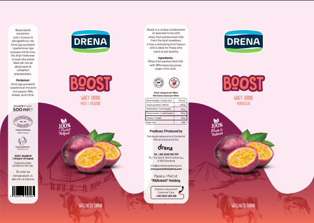
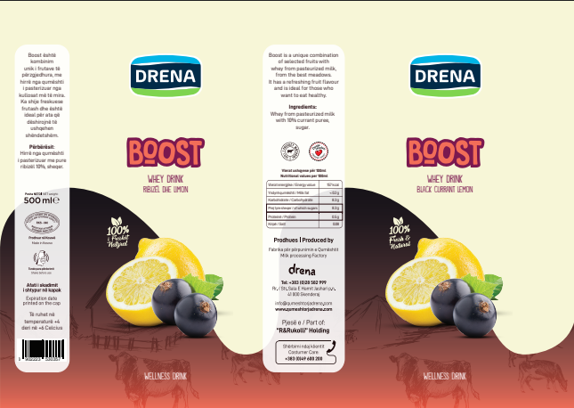
The finished packaging is legible at shelf distance and coherent across the range, and it was handed over as print-ready artwork with the die lines and the colour breakdowns each surface needs.