Mobile Menu

Menu
- Rruga B, Prishtinë
- +38349133000
- info@hoxmedia.net
A distinctive brand identity that leaves a lasting impression.
Distinct. Consistent. Memorable.
Bonipharm is a pharmacy with years in the market, customers who trust it, and an online shop it was running long before most of its competitors had one. It wanted an identity that looked as current as its service and still read as care, not the crosses and pill icons that every pharmacy sign repeats.
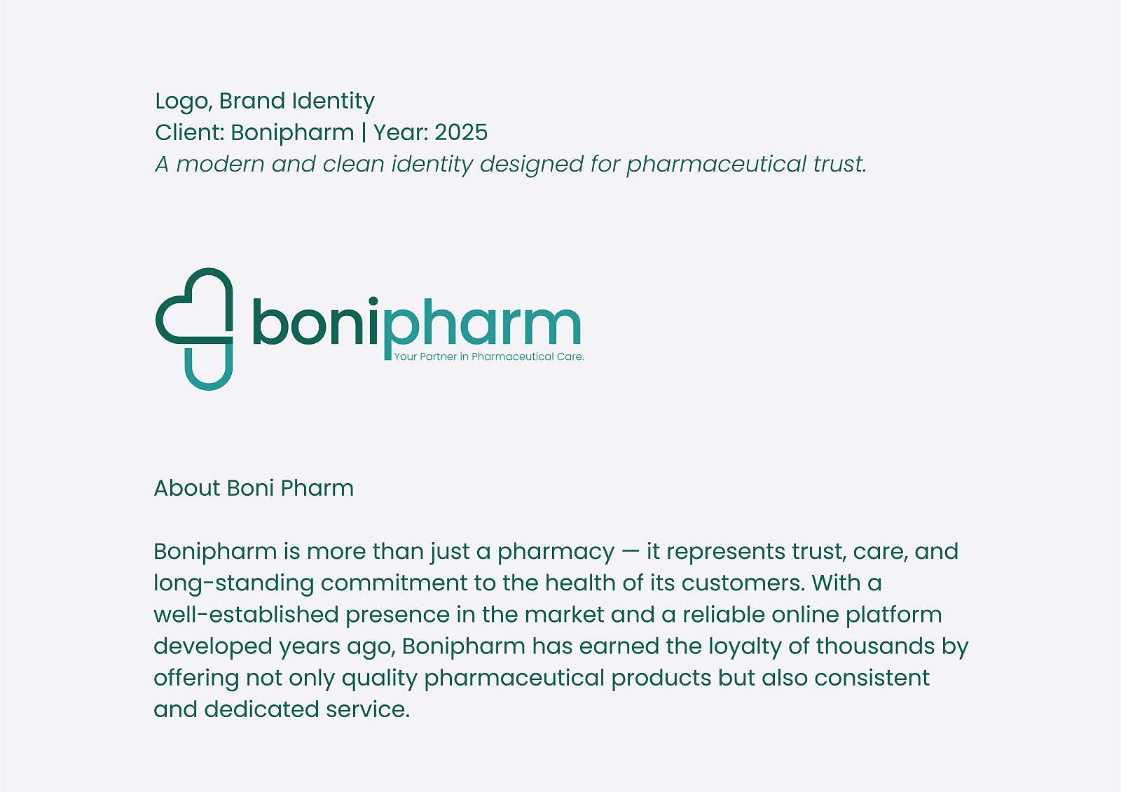
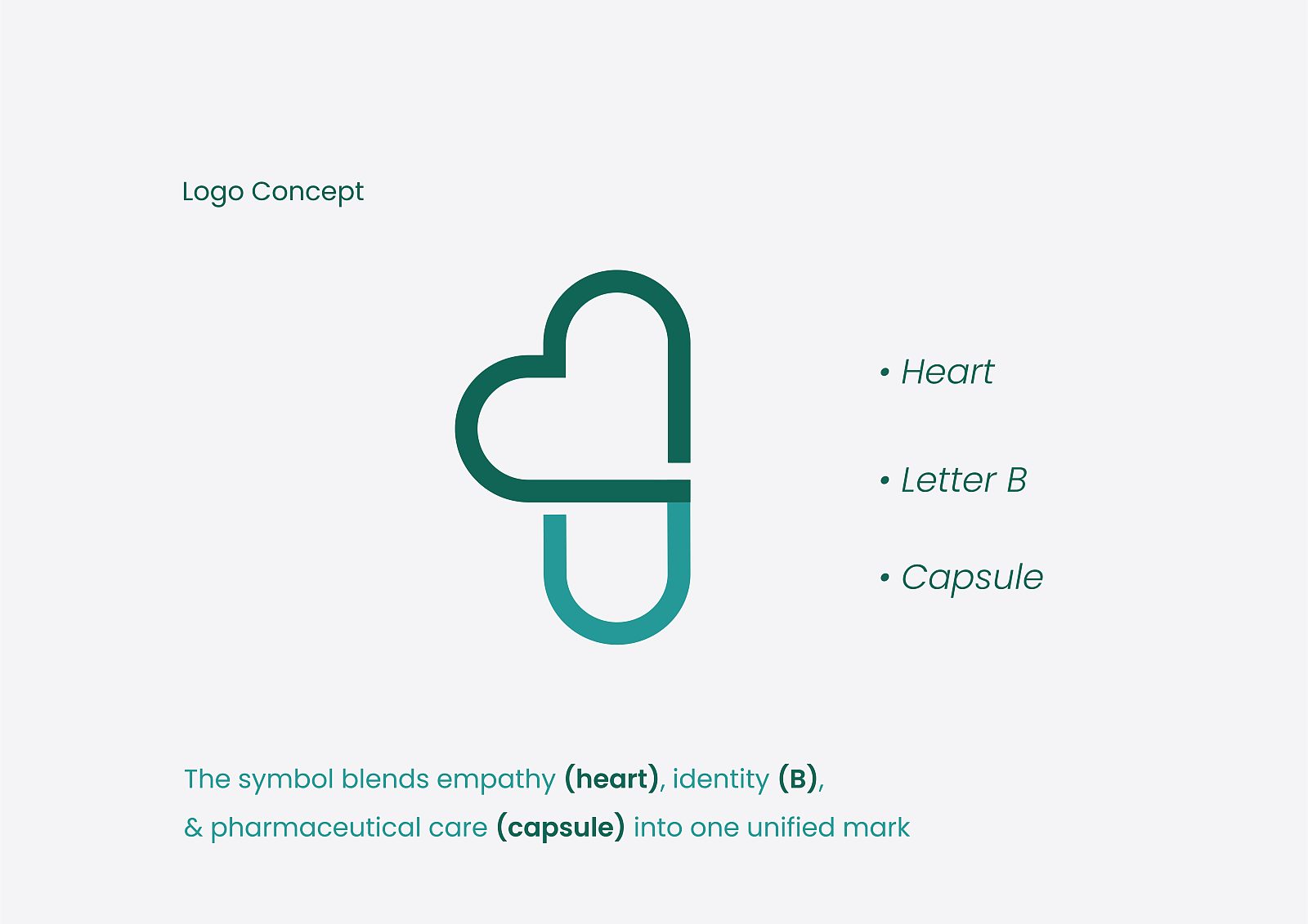
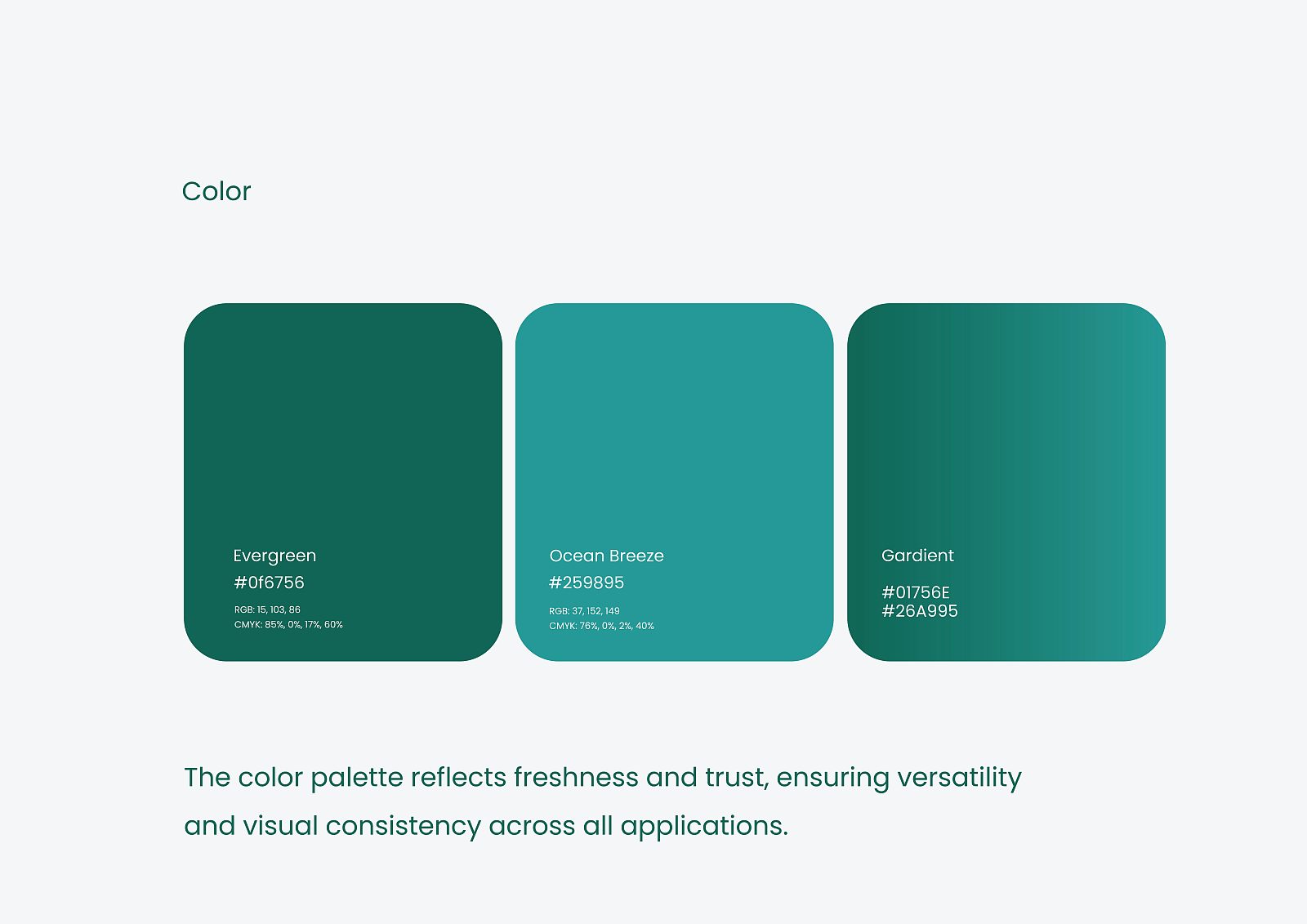
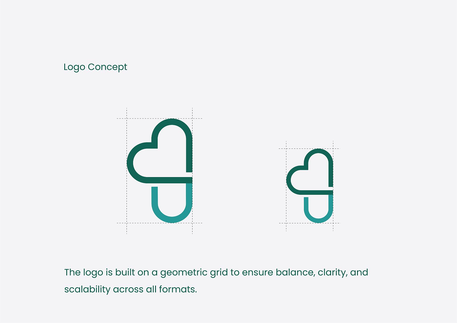
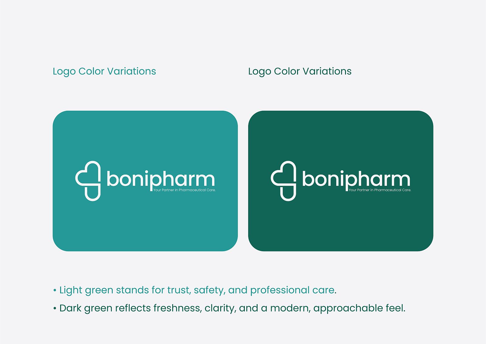
The symbol folds three ideas into one line: a heart for the care, the letter B for the name, and a capsule for the work itself. It was built on a geometric grid so it keeps its balance from a shop sign down to a profile picture, and set in two greens, one for trust and professional care and one for freshness.
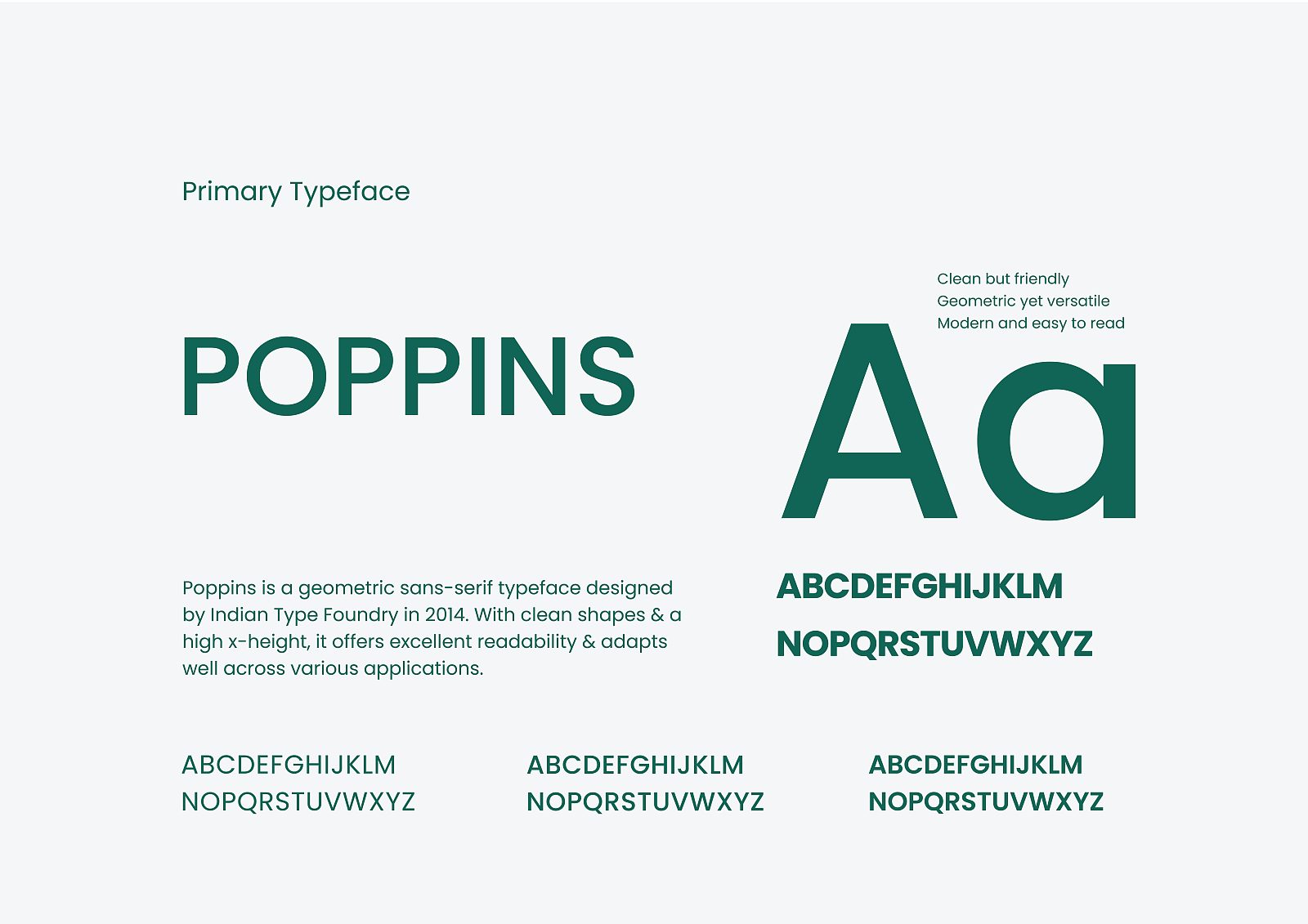
What went out is a system that works on the counter and on the doorstep: the sign, the packaging, the delivery van, the shipping bag, the online shop and the social channels, all in the same greens and in Poppins, so a customer meets one pharmacy whether they walk in or order from home.