Mobile Menu

Menu
- Rruga B, Prishtinë
- +38349133000
- info@hoxmedia.net
A distinctive brand identity that leaves a lasting impression.
Distinct. Consistent. Memorable.
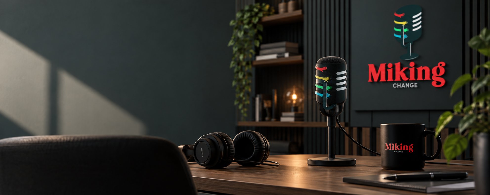
Miking speaks for people who are not usually spoken for, and the brief asked the mark to say unity across religion, race, gender and sexual orientation, without resorting to the symbols that have already been used until they mean nothing.
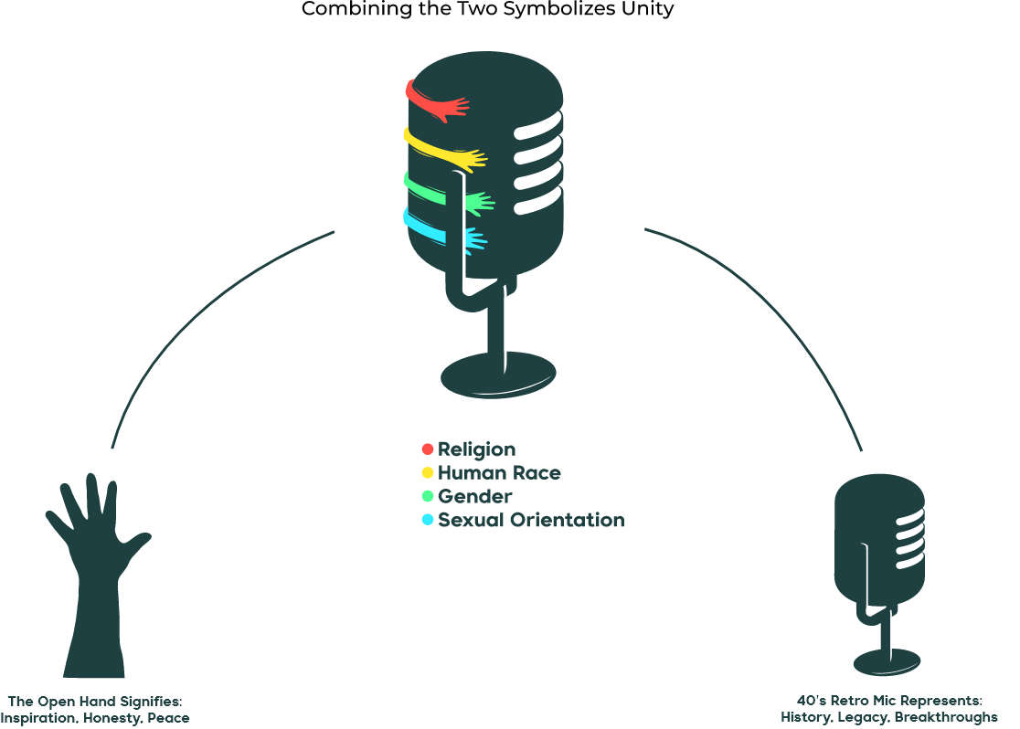
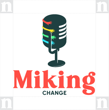
One form made of parts that stay distinct: nothing dissolves into the whole and nothing dominates it. That is the argument the organisation makes, put into a shape rather than into a slogan. It was resolved in a single colour first, because the mark has to hold on a photocopied leaflet as surely as on a screen.
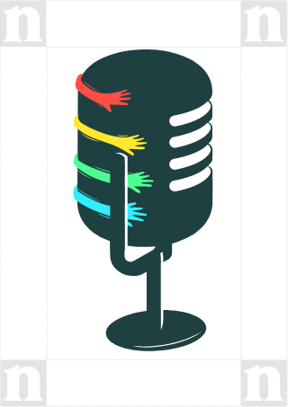
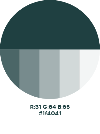
The mark carries the idea without spelling it out, and works at the sizes a small organisation actually needs: a badge, a banner, a document header. The identity was handed over with the rules for using it.