Mobile Menu

Menu
- Rruga B, Prishtinë
- +38349133000
- info@hoxmedia.net
A distinctive brand identity that leaves a lasting impression.
Distinct. Consistent. Memorable.
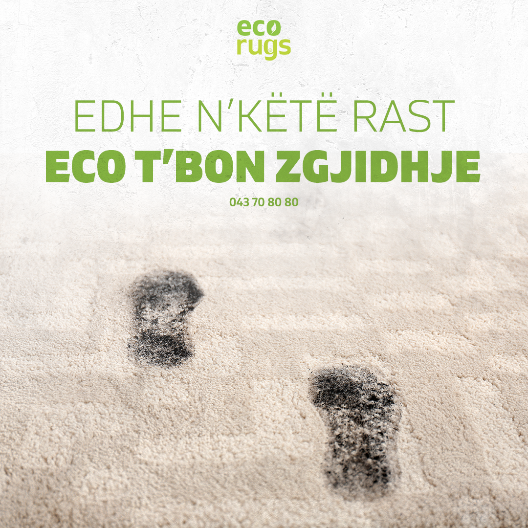
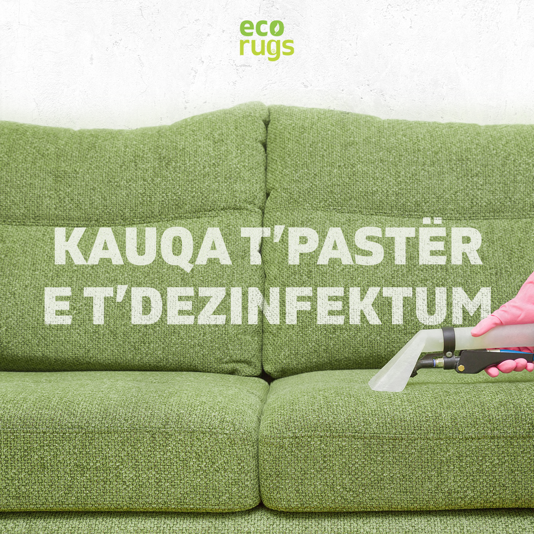
Eco Rugs came with a clear idea of what the business stood for and nothing to say it with: no name settled, no mark, no identity. Cleanliness is the whole promise of the trade and also the hardest thing to draw, since every cleaning company in the world already claims it.
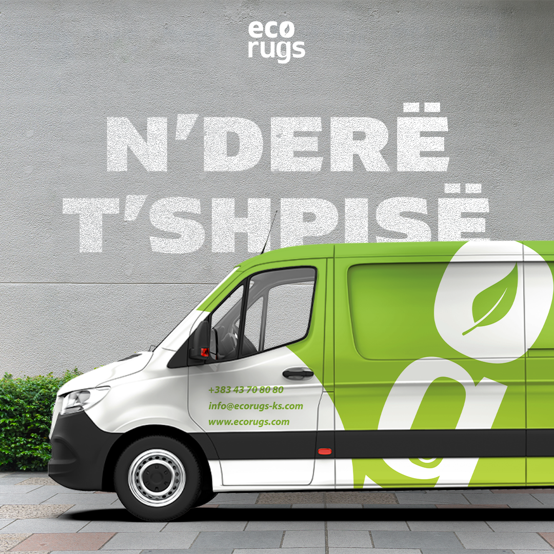
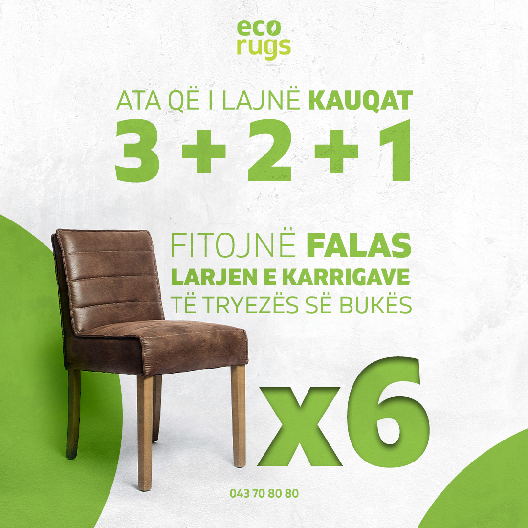
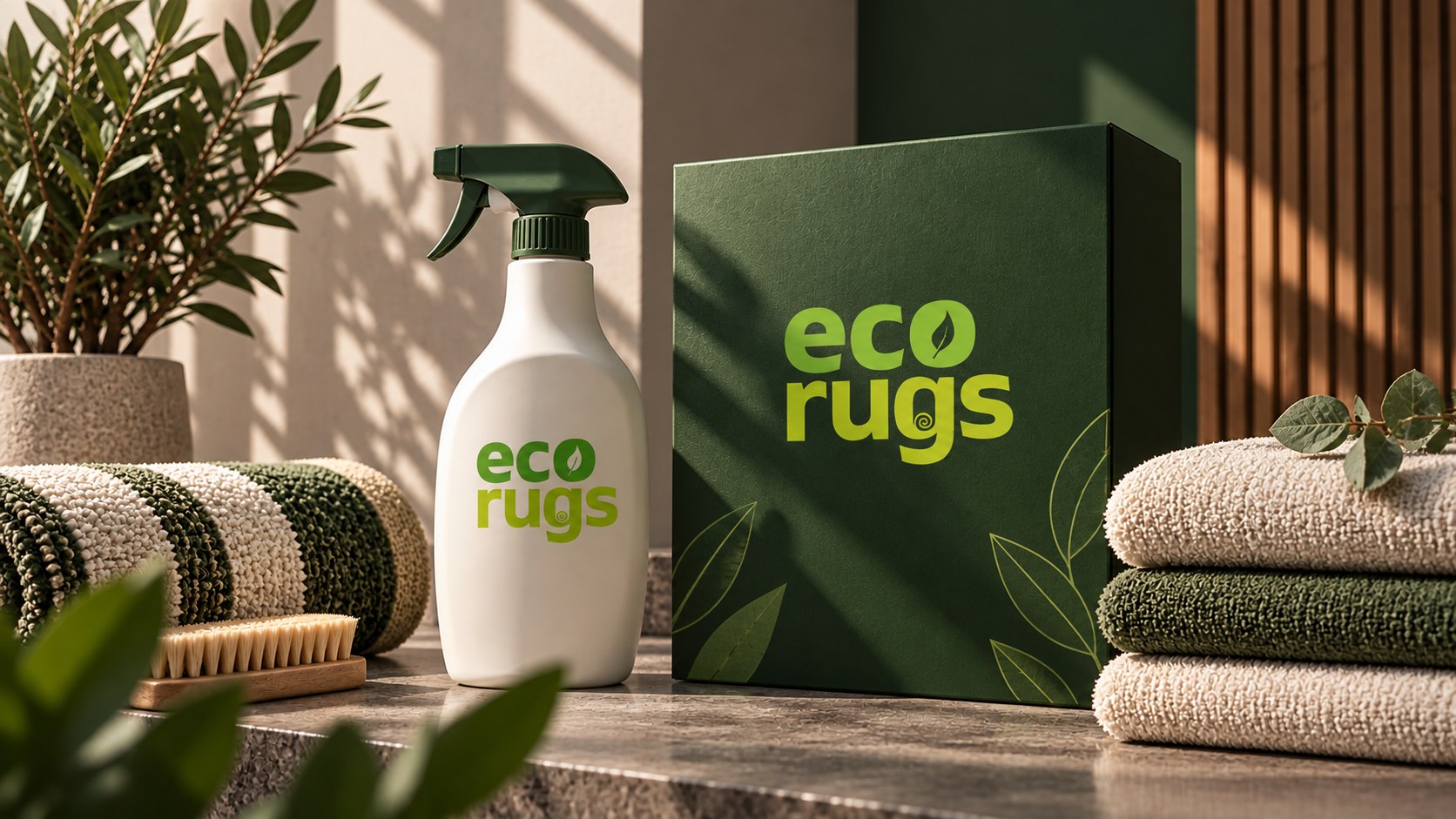
The name came first, because everything else has to be built on it. From there the identity was drawn to feel clean rather than to state it: generous white space, a mark with nothing surplus in it, and a palette that reads as fresh without going to the pale blues the sector defaults to.
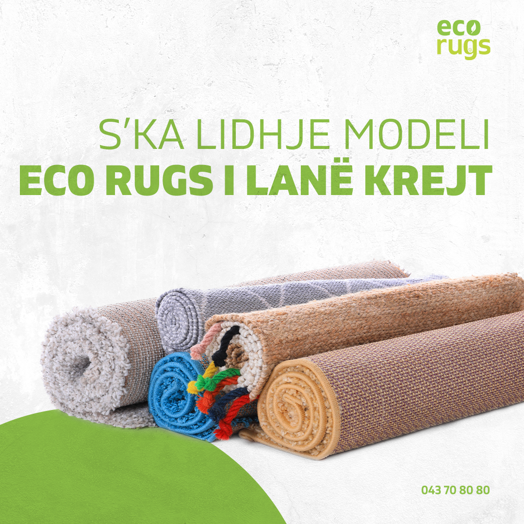
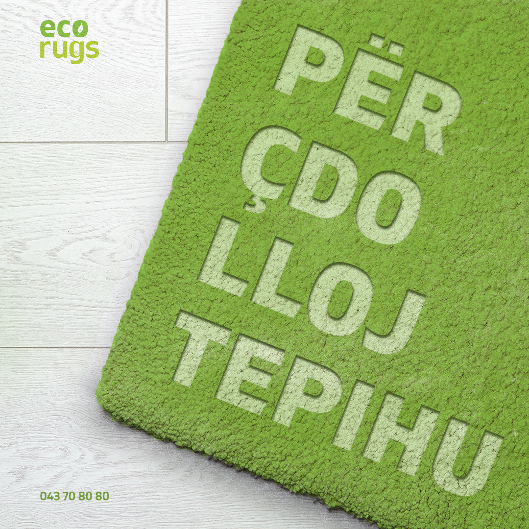
The client left with a name, a mark, a palette and the rules for using them, drawn to work on a van, an invoice and a phone screen alike.